
ViewCompanion Application Themes
ViewCompanion includes several built-in application themes that allow you to customize the look and feel of the user interface. By selecting a different theme, you can adjust the appearance of menus, toolbars, ribbons, dialogs, docking windows, and other parts of the application to better match your personal preferences or working environment.
Available themes include modern light themes, darker themes, and classic color styles such as Colorful, White, Black, and Dark Gray. The screenshots below show examples of the different themes available in ViewCompanion.
How to Change the Theme
To change the application theme in ViewCompanion, go to the Settings tab and press the Application Theme button.
After selecting a new theme, the ViewCompanion user interface will be updated to use the selected appearance. This makes it easy to switch between a bright theme for normal office use and a darker theme for reduced eye strain in low-light environments.
Why Use Different Application Themes?
Different application themes can improve usability and productivity depending on your working environment and display preferences. Light themes are often preferred in bright office environments, while dark themes can be more comfortable during long working sessions or when reviewing large PDF, DWF, DXF, HPGL, Gerber, or other technical files.
Available ViewCompanion Themes
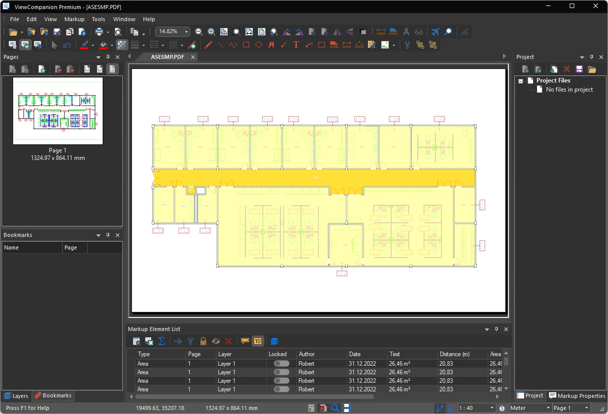
Dark Gray Theme
The Dark Gray theme provides a modern dark interface designed for comfortable long-term use. This theme can help reduce eye strain when working in low-light environments or when reviewing large drawings and documents for extended periods. This is the default theme.
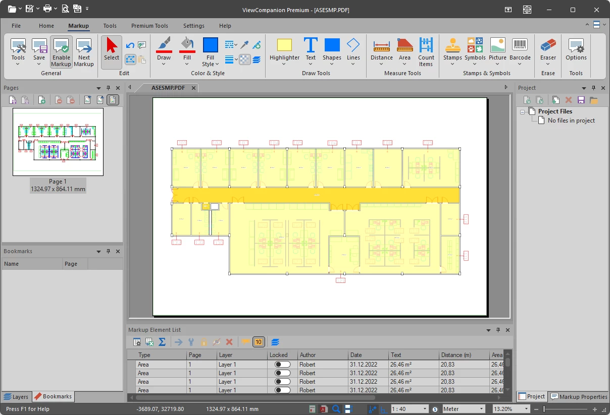
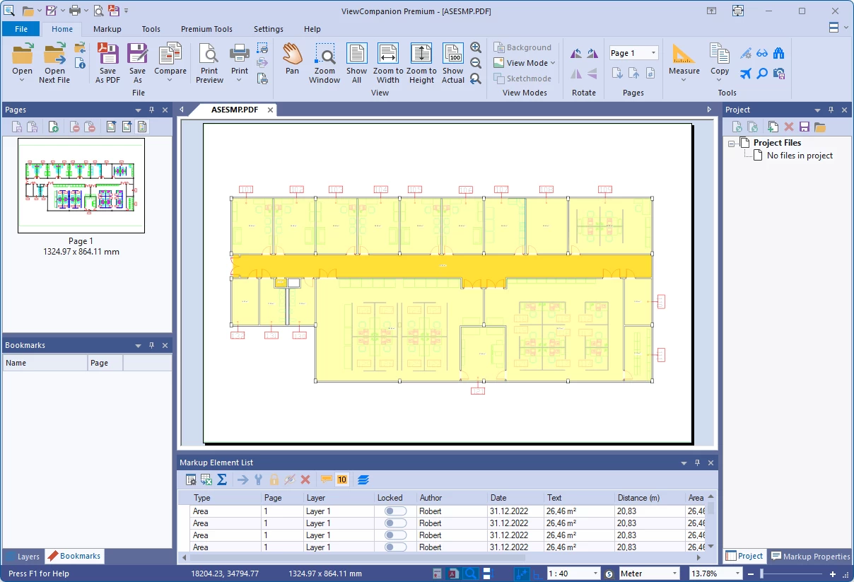
White Theme
The White theme gives ViewCompanion a clean and minimal appearance. This theme works well in bright office environments and provides a neutral background for viewing and converting technical documents.
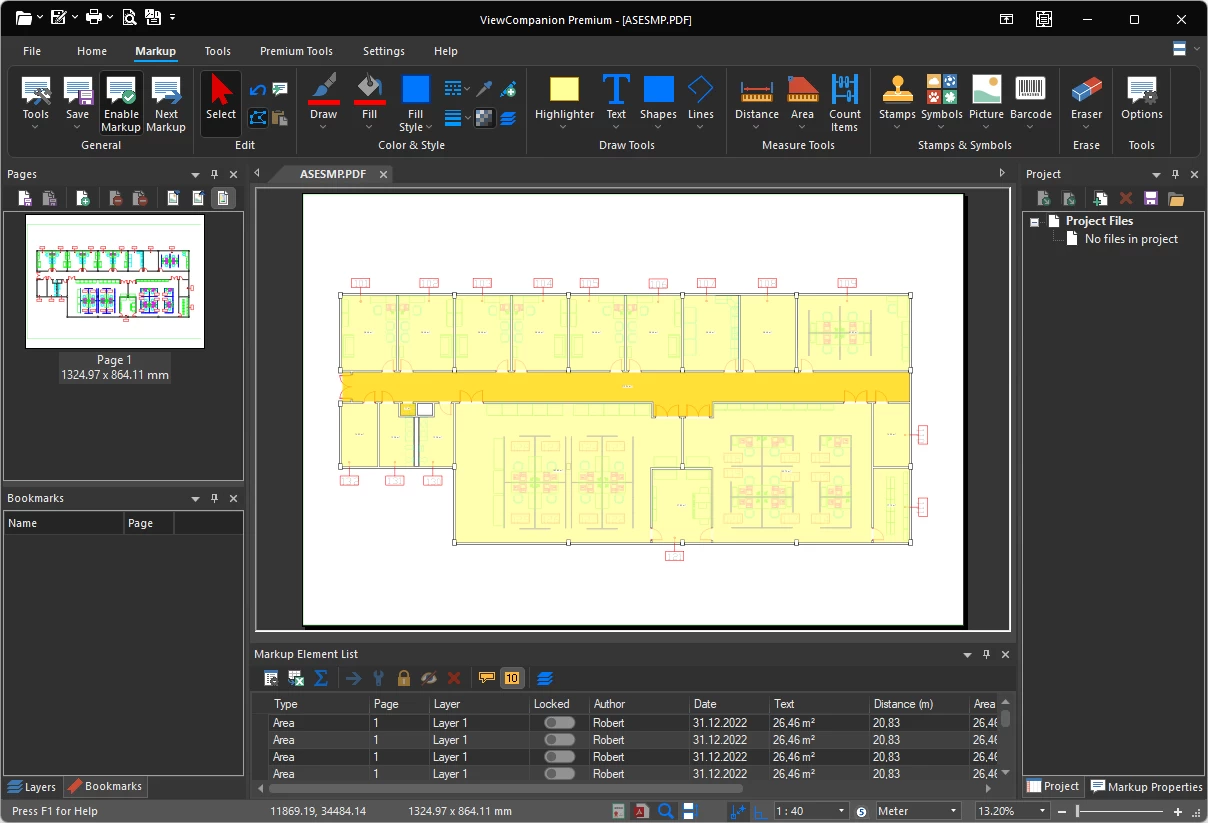
Black Theme
The Black theme offers the darkest ViewCompanion user interface style. It is useful for users who prefer a high-contrast dark workspace while viewing, comparing, printing, or converting files.
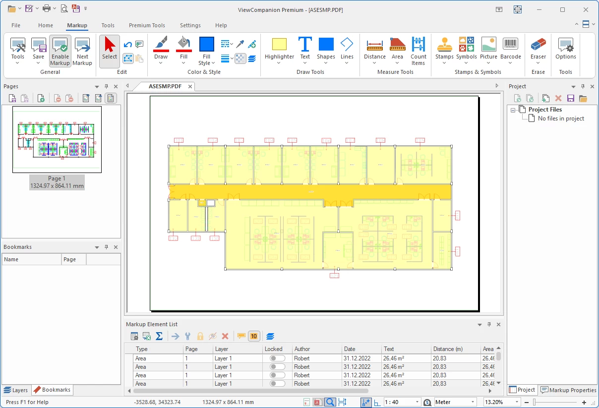
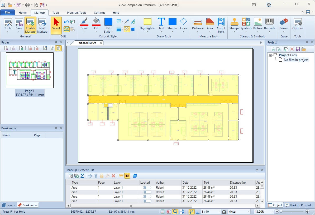
Colorful Theme
The Colorful theme provides a modern and familiar user interface with clear visual separation between ribbons, toolbars, dialogs, and document windows. It is a good choice for users who prefer a bright and easy-to-read interface. This is the default theme.
Colorful Green Theme
The Colorful Green theme combines a modern user interface with green accent colors applied to ribbons, dialogs, and toolbars. This theme offers a fresh and comfortable workspace while preserving the familiar ViewCompanion layout and functionality.
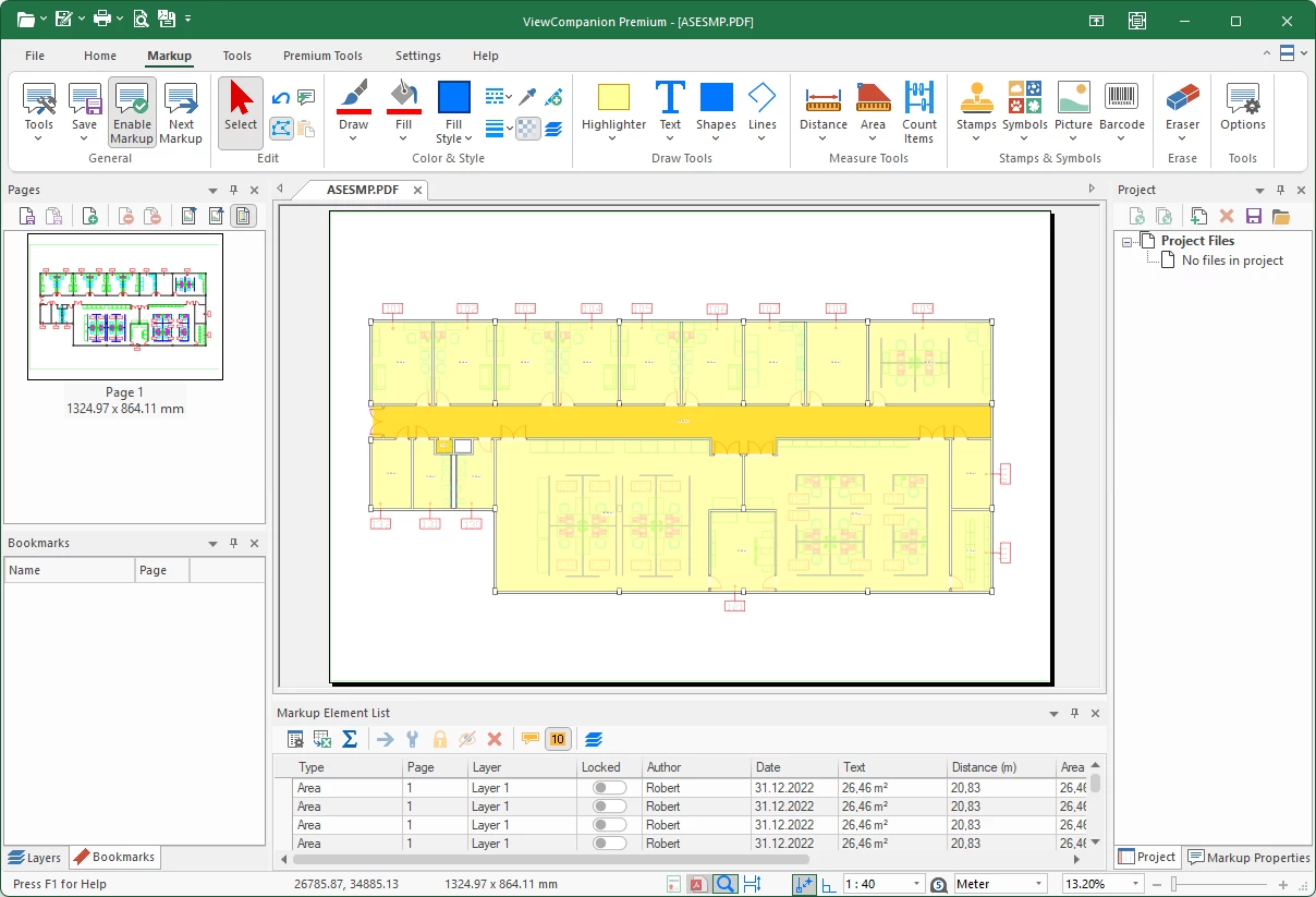
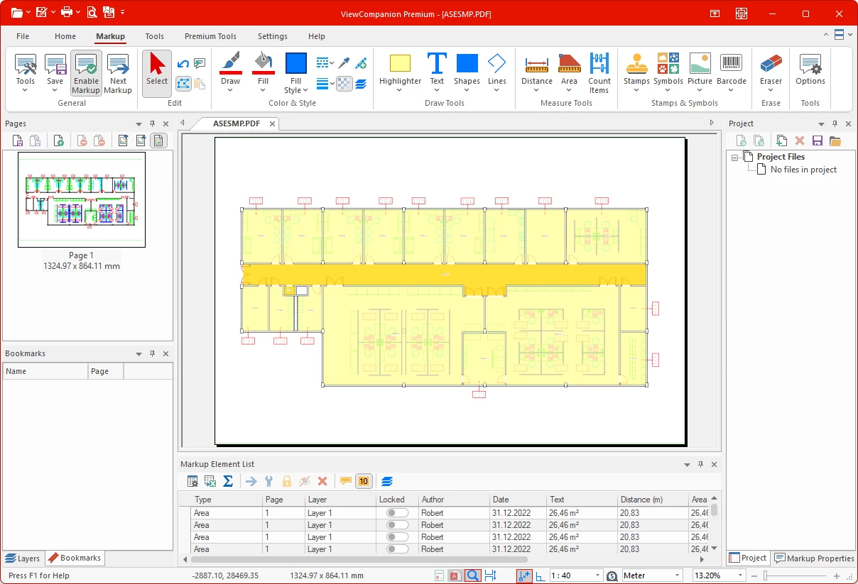
Colorful Red Theme
The Colorful Red theme combines a modern interface with bold red accent colors applied to ribbons, dialogs, and toolbars. This theme offers a visually distinctive workspace while preserving the familiar ViewCompanion user experience.
Light Blue Theme
The Light Blue theme combines a bright user interface with subtle blue accent colors applied to ribbons, dialogs, and toolbars. This theme offers a clean and professional workspace with a light visual style that works especially well in bright office environments.
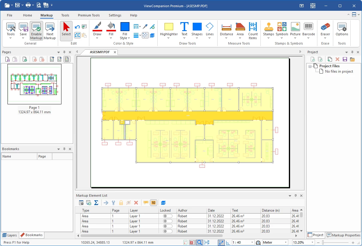
Blue Theme
The Blue theme gives ViewCompanion a modern and professional appearance using blue accent colors across ribbons, dialogs, and toolbars. This theme provides a clean and comfortable workspace that is well suited for both office environments and extended daily use.
Classic Menu and Toolbar Mode
All themes are available in both Ribbon mode and Classic mode. The Classic mode uses traditional menus and toolbars, which may be preferred by users familiar with older versions of ViewCompanion or other desktop applications.
Theme Support in ViewCompanion
The selected theme affects most parts of the ViewCompanion user interface, including ribbons, menus, toolbars, dialogs, docking windows, document tabs, and other visual elements. This makes it possible to create a more comfortable workspace while keeping the same powerful ViewCompanion functionality.
Changing the theme does not affect your files, settings, conversion options, markup, measurement tools, or print setup. It only changes the visual appearance of the application.
Frequently Asked Questions
Can I use dark mode in ViewCompanion?
Yes. ViewCompanion includes dark application themes, including Black and Dark Gray themes.
Can I use a light theme?
Yes. ViewCompanion includes light themes such as White and Colorful themes.
Do all themes support the Ribbon interface?
Yes. All available themes can be used with the Ribbon interface.
Do all themes support Classic menu and toolbar mode?
Yes. All themes are available in both Ribbon mode and Classic menu and toolbar mode.
Does changing the theme affect document conversion?
No. Changing the application theme only affects the appearance of the ViewCompanion user interface. It does not change how documents are opened, viewed, printed, compared, or converted.
Learn More
To learn more about ViewCompanion and its available features, visit the main product pages:
ViewCompanion Standard product page.
ViewCompanion Pro product page.
ViewCompanion Premium product page.

